I help creatives build and monetize their digital art skills. I send out a freebie, quick tip or tutorial every Tuesday to make learning digital art fun and approachable.
Your Guide to Gorgeous Fall Flourishing 🍁
|
The days are getting shorter 🍂so let’s brighten them up with some fall flourishing! While we’ll use these tips for fall themes, these are lifelong methods you can repurpose for any future lettering, too! Even if you’re brand new to flourishing, these tips will elevate your lettering, no matter your skill level. We’ll go through each, step-by-step, and talk about *why* they work so well (not just how to make them!). Composition is key, even if we’re only working with one word – so we’ll also go over a checklist to guarantee yours is strong every time! Let’s take the word ‘harvest’. Lettering following the basics might look like this with a standard lettering grid (meaning there’s no extreme contrast in proportions): Let’s add a little contrast now in proportions and add a little bounce to it, too: Now we’ve got some personality! Do you see how it feels balanced? Nothing is dipping so far up or down that it’s distracting and taking away from reading the word as a whole. Meaning I don’t immediately look at the ‘rv’ or any other combo before reading ‘harvest’ first. This is your sign that the foundation of your composition is in a good place. ✨ Make sure you’re seeing and reading your full word vs. an individual letter relationship before moving onto flourishing. Quick tip for Bounce Lettering Here’s what I mean by downstroke (the last stroke you make to complete the letter is in a downward motion): Now it’s time to flourish! The most important tip here is consistency. Consistency….everywhere. Make your curl style consistent: Match how you end your strokes (called terminals): Keep the style/shape/weight of your loops consistent: Line weight consistency: And here’s the breakdown of my decisions: It may have been hard to tell *why* before, but now you know. Even if some parts are strong (bounce, contrast in proportions) it can still fall apart visually (flourishing). It’s ALL because of inconsistencies. Tighten those up and your artwork will always look more elevated + pro. If you’re not comfortable with bounce lettering yet, you don’t need to add it every time before flourishing! Here’s an example of *slightly* altering basic lettering and combining it with flourishing: This is all monoweight, too, so using a pressure sensitive brush/stylus is also optional! |
Hey! I'm Teela
I help creatives build and monetize their digital art skills. I send out a freebie, quick tip or tutorial every Tuesday to make learning digital art fun and approachable.
With Black Friday upon us, I decided it was time to put together the first ever ✨ Every Tuesday Holiday Gift Guide! ✨ And it contains my very best recommendations from the past 10+ years working as a designer, illustrator and online educator. Inside, you’ll find the categories: technology, watercolor + lettering, crafting, books and a miscellaneous section of personal favorites. This is not your typical gift guide. First, the guide only contains products/services I have personally purchased...
This started out as a summer floral pattern, but one tweak led to another and I ended up with a fancy floral pattern instead 🙃 Changing up the color palette could def still give it a summer feel, but I couldn’t resist sharing it with this one once it all came together. 😍 Pick up the free ogee symmetry block stamp below along with the colors to get started! Mentioned in this video ✅ Ogee pattern block stamp (free brush)✅ Color palette (free)✅ Bouquet Maker brush set✅ Pattern Types cheat sheet...
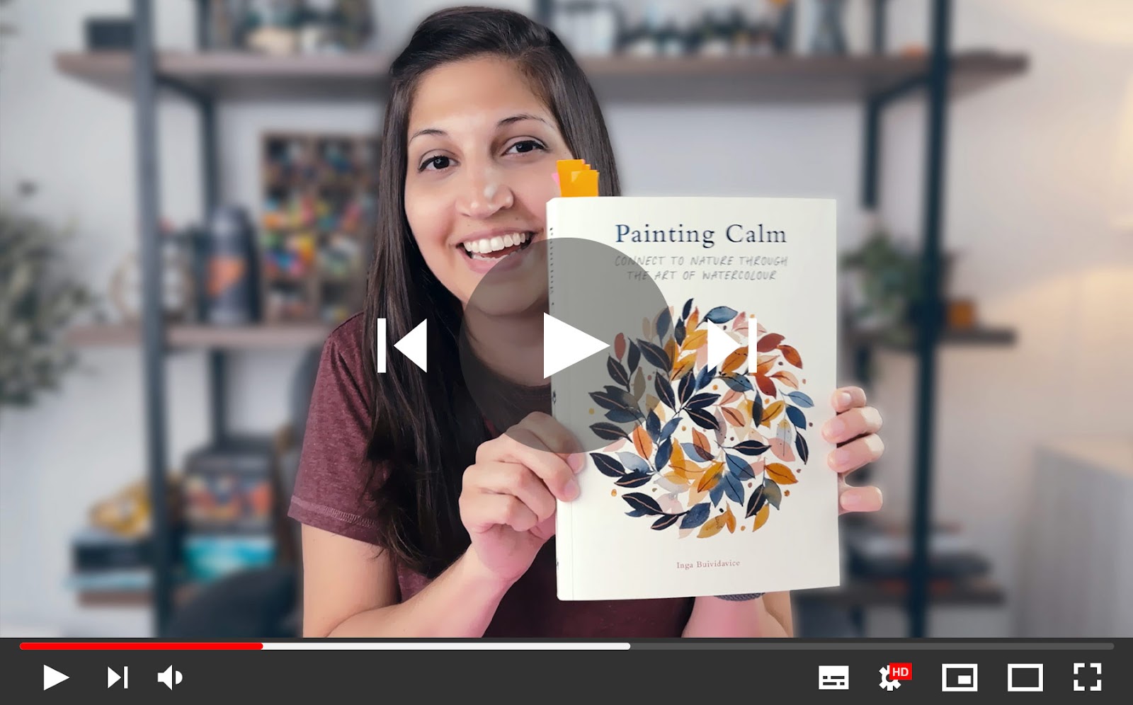
When I mentioned the Flower Color Guide book in my How to Find your Art Style vid, I had a few requests for more recs, so I’m here to deliver! These 7 books truly helped me to become a better floral illustrator and I’ve reached for them constantly over the years when I’ve needed inspiration or a good reference photo that didn’t come from Pinterest 🙃 In the vid, I’ve included overviews of each along with what I use them for the most. I also included a bunch of flip throughs, so get ready for...